Paint a portrait, landscape, or still life. But instead of mixing the colors on your palette, use optical color mixing. Place tiny dots side by side to develop the shapes and forms in your composition.
Back to Teacher View
Student View
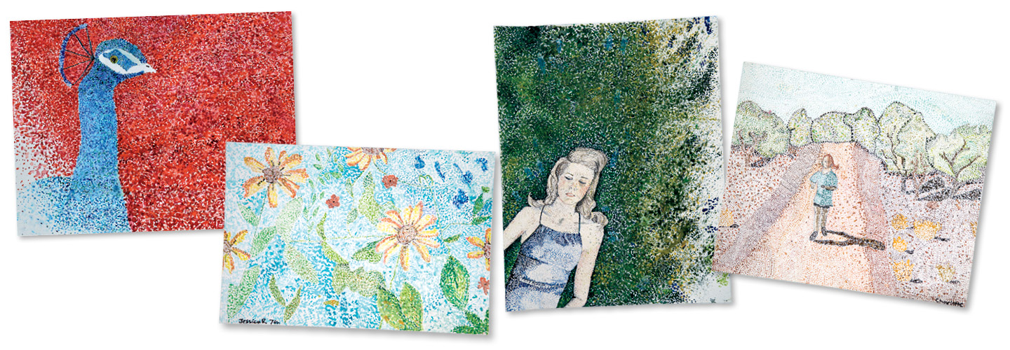
How does each student visually communicate?
Photography by Amy Mikler.
Enjoy this bonus article from our friends at Scholastic Art magazine!
Design With Dots
Use what you’ve learned about working with color to create your own composition
Studio Project Prompt:
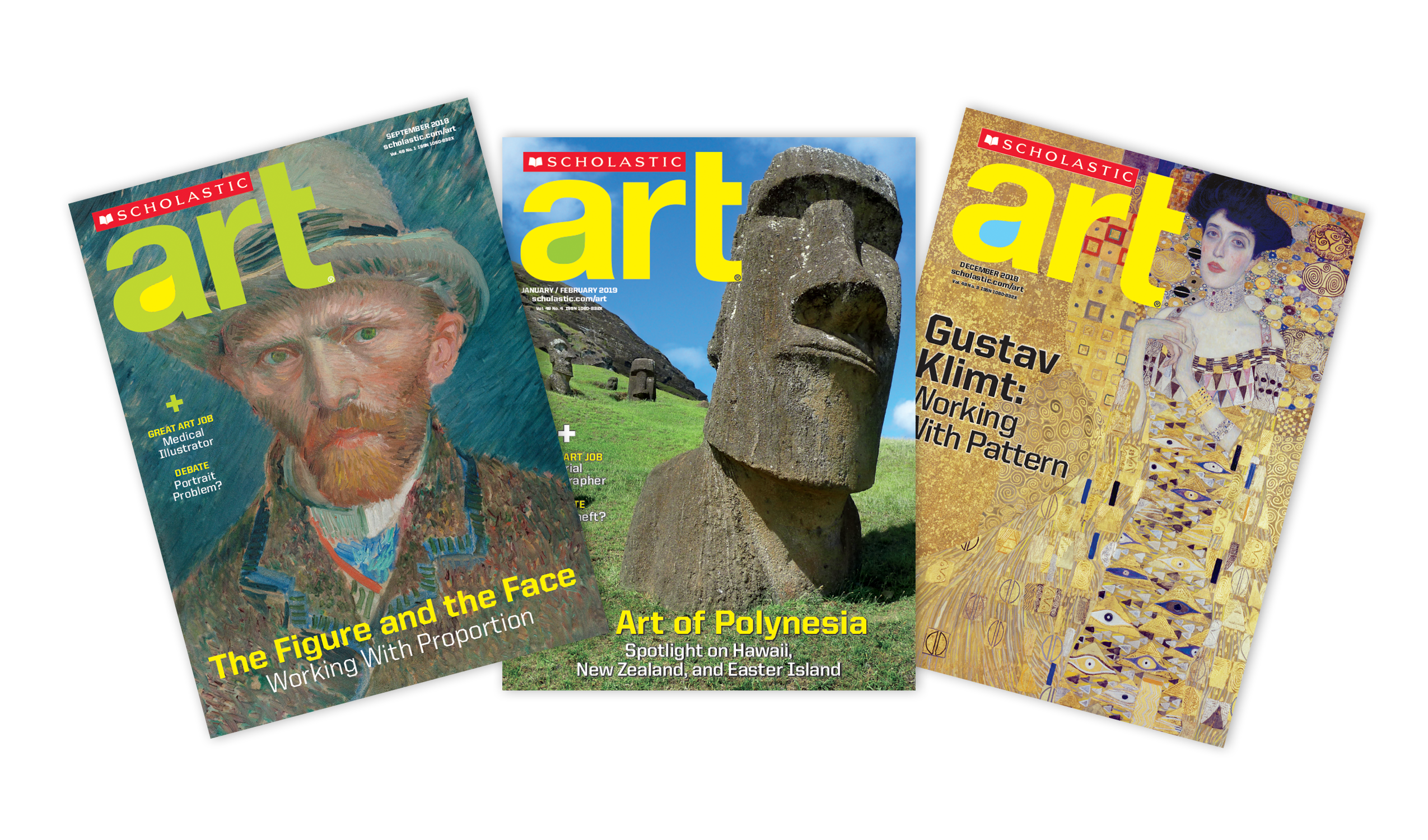
Like what you see? Try Scholastic Art magazine.
Parameters:
- Start with primary colors red, yellow, and blue plus black and white on your palette.
- Use only black and white to adjust the tint or shade of the colors you’re working with.
- To create shadows and highlights, add complementary colors.
- Experiment by juxtaposing unexpected colors.
- Use color to create, emphasize, or set the mood.
Before you begin, check out examples by the students at The Girls’ School of Austin in Austin, Texas in the slideshow above!
Share this bonus article from Scholastic Art magazine with your fellow teachers!
Text-to-Speech